Bottom Navigation Bar
The Bottom Navigation Bar provides quick access to key sections of your app, similar to the user experience in apps like Instagram or YouTube. QuikApp allows you to fully customize the navigation menu, layout, styling, and behavior to match your app’s branding and user flow.
Configuration Tabs
The bottom navigation configuration is organized into three main tabs for streamlined setup:
- Menu: Build your navigation items and control visibility.
- Presets: Choose from a variety of ready-to-use theme templates.
- Customize: Fine-tune every aspect of the navigation bar’s appearance and layout.
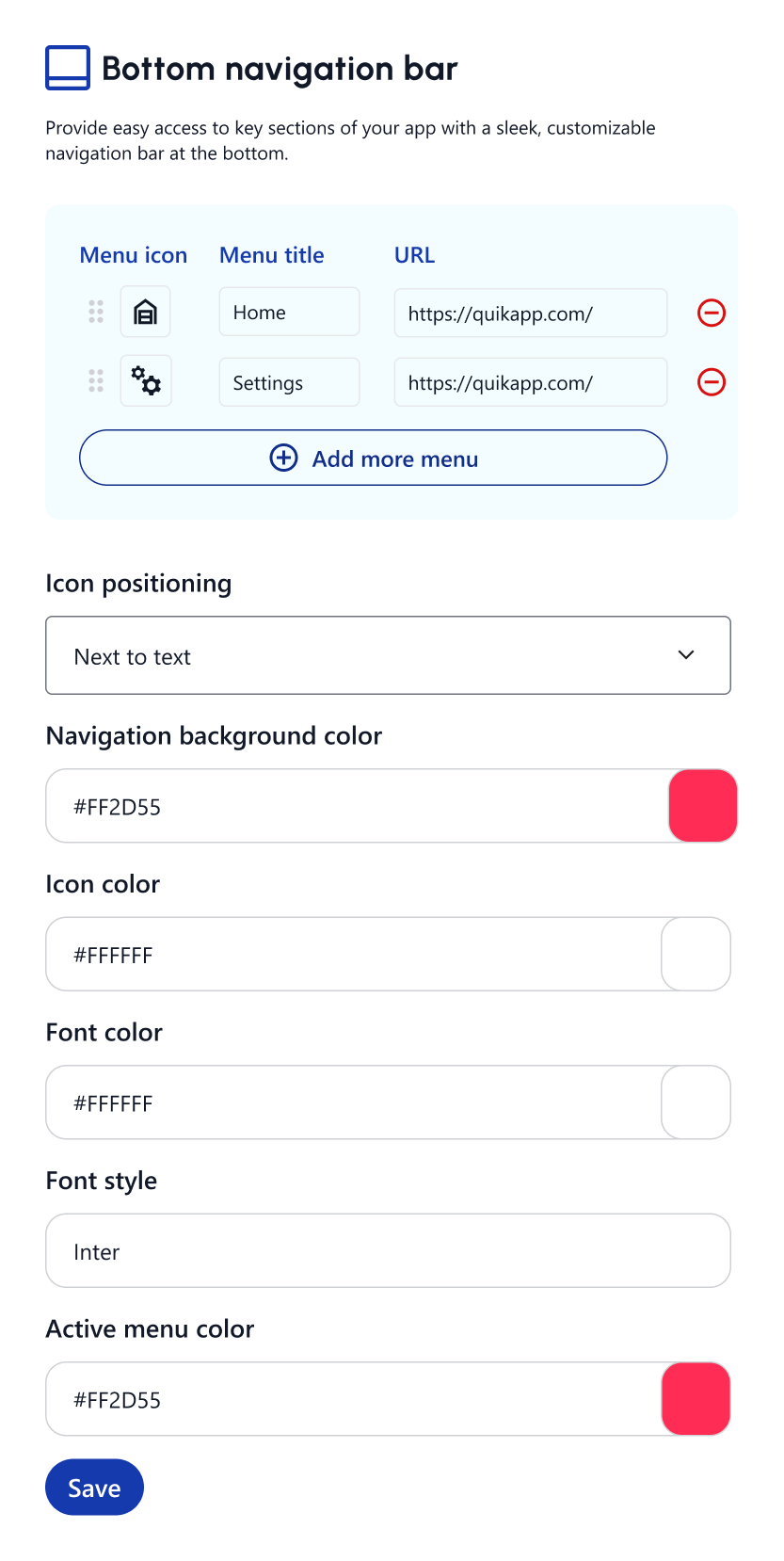
1. Menu Tab
Navigation Items (Tabs)
You can add up to 5 navigation tabs. For each tab, you can configure:
You can add up to 5 navigation tabs. For each tab, you can configure:
- Menu Icon: Select an icon from the QuikApp icon library or upload custom icons. You can also drag and drop to reorder the items.
- Menu Title: Text label shown below or beside the icon (e.g., Home, Menu, FAQ, Contact).
- URL: The specific destination link that opens when the tab is tapped. Remove Icon (–): Delete a navigation item.
Chatbot Integration
Enable Chatbot (Toggle): Allows you to add a Chatbot tab directly into the bottom navigation bar for instant user support. Note that this counts towards the 5-tab limit.
Hide Bottom Menu on Specific Pages
Configure the bottom navigation bar to be hidden on specific screens where it might distract the user (e.g., login or checkout pages).
+1
- Specify exact website URLs where the bottom menu should disappear. +1
- Easily add or remove multiple URLs.
2. Presets Tab
To save time and achieve a professional look quickly, select from a curated list of Theme Templates/Presets.
- These presets automatically apply cohesive styling, colors, and layout configurations.
- Select a preset that fits your app (e.g., modern glass effect, classic solid, gradient burst) and further adjust it in the Customize tab.
3. Customize Tab
The Customize tab offers extensive options to tailor the look and feel of your navigation bar:
- Style & Appearance (Background) Navigation Background Color: Sets the solid background color for the bar.
- Glass Effect: Adjust the background blur for a modern, semi-transparent look.
- Gradient Background: Enable and pick two colors for a beautiful gradient background.
Icons & Labels
- Font Color & Icon Color: Define the colors for inactive tabs.
- Typography: Choose a Font Style family (e.g., Roboto) and Font Format (Bold, Italic).
- Size: Adjust Icon Size and Label Size.
- Visibility: Toggle Show Labels or Active Label Only for a cleaner look.
Selected Tab Style
Customize how the currently active tab stands out:
- Active Colors: Set the Active Menu Background, Active Icon Color, and Active Text Color.
- Active Background Shape: Adjust the Active BG Width, Height, Opacity, and Radius.
- Active Size: Set a specific Active Icon Size and Label Size.
- Animations & Lines:
- Sliding Animation: Smooth glides between selected tabs.
- Top Active Line: Add an indicator line and configure its Height, Position, Radius, Width, and Color.
Navigation Behavior
- Nav Bottom Space: Adjust the spacing between the bottom of the screen and the navigation bar.
- Label Position: Position text Top, Bottom, Left, or Right of the icon.
- Center Button Big: Make the middle tab larger and prominent (available for odd numbers of tabs like 3 or 5). Customize its Background and Icon Color separately.
- Auto Hide While Scroll: Automatically hide the navigation bar when the user scrolls down and show it when scrolling up.
Advanced Layout Settings
- Proportions: Fine-tune Nav Height, Nav Width, Button Height, and Menu Width percentages.
- Spacing: Adjust the overall Border Radius and the Icon-Label Gap.
Why It’s Useful
- Quick Access: Allows users to navigate between main sections with a single tap.
- Improves Usability: Reduces navigation friction and improves the overall app experience.
- Brand Consistency: Custom colors, fonts, and icons help maintain a consistent brand identity.
How to Enable Bottom Navigation
- Go to your App overview (App Dashboard).
- Navigate to Customization → Bottom Navigation Bar.
- Use the Tabs to configure your items, apply a preset, or deeply customize the layout and behavior.
- Add your URLs and specify any hidden pages optionally.
- Save and preview the app in real time!